


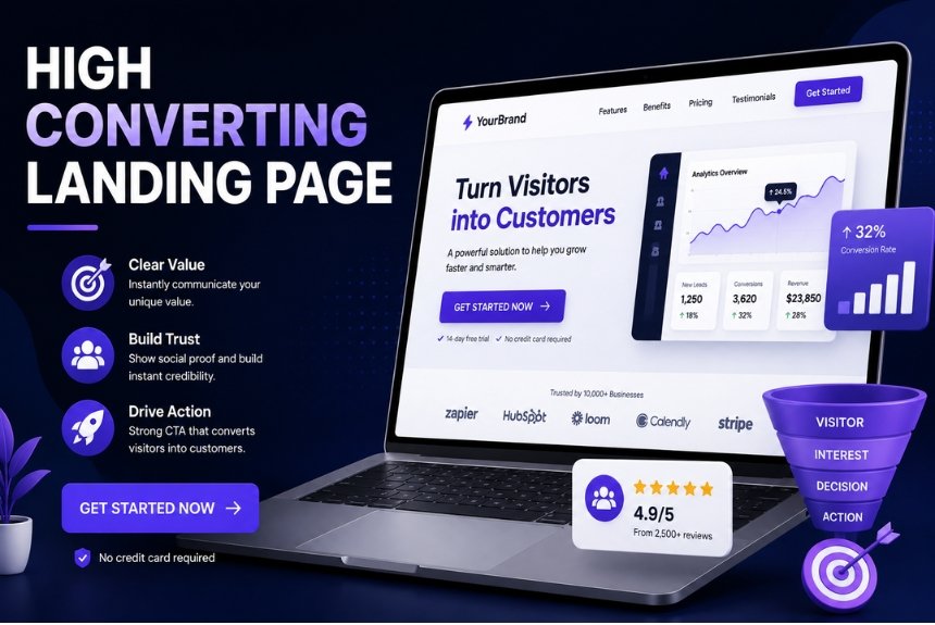
How to Create High-Converting Landing Pages
A landing page is often the first impression a potential customer has of your business. Whether you’re running paid ads, promoting a product, collecting email subscribers, or launching a new service, the quality of your landing page can determine whether visitors convert or leave without taking action.
Unlike a standard website page, a landing page has one clear objective: to encourage visitors to complete a specific action. That action could be signing up for a newsletter, downloading an ebook, registering for a webinar, requesting a demo, or making a purchase.
With rising advertising costs and increasing competition, businesses can no longer rely on attractive designs alone. Successful landing pages combine persuasive copywriting, user-focused design, compelling visuals, fast loading speeds, and data-driven optimization to maximize conversions.
Modern landing page builders make it easier than ever to create professional, responsive pages without coding. However, simply using a landing page builder isn’t enough. The real difference comes from understanding what motivates visitors and designing every element around a single conversion goal.
In this complete guide, you’ll learn:
- What makes a great landing page
- How to define your conversion goal
- How to write headlines that grab attention
- Best practices for persuasive copywriting
- Using images and videos effectively
- Optimizing calls-to-action (CTAs)
- Running A/B tests
- Measuring landing page performance
- Common mistakes to avoid
- A practical checklist for higher conversions
By the end of this guide, you’ll have a clear framework for creating landing pages that not only look professional but also generate more leads and sales.
What Makes a Great Landing Page?
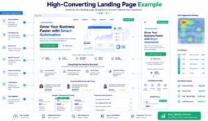
A high-converting landing page is more than an attractive design. Every element should work together to guide visitors toward one specific action.
The best landing pages share several characteristics:
- Clear value proposition
- Compelling headline
- Relevant visuals
- Persuasive copy
- Strong call-to-action
- Mobile-friendly design
- Fast loading speed
- Trust signals
- Minimal distractions
- Data-driven optimization
When these elements are combined effectively, visitors are more likely to stay on the page, engage with the content, and convert.
Essential Elements of a High-Converting Landing Page
1. A Clear Value Proposition
Visitors should immediately understand:
- What you’re offering
- Why it matters
- How it solves their problem
- Why they should choose your solution
A strong value proposition reduces confusion and encourages users to continue reading.
2. One Primary Goal
Avoid overwhelming visitors with multiple choices.
A landing page should focus on a single conversion objective, such as:
- Download an ebook
- Register for a webinar
- Start a free trial
- Request a consultation
- Purchase a product
- Subscribe to a newsletter
The more focused the page, the higher the likelihood of conversion.
3. Minimal Navigation
Unlike a homepage, a landing page should minimize distractions.
Best practices include:
- Remove unnecessary menu items
- Limit external links
- Keep the visitor focused on the CTA
- Reduce competing actions
This approach encourages users to complete the intended action instead of browsing away.
4. Mobile Optimization
A large percentage of web traffic now comes from smartphones and tablets.
A mobile-friendly landing page should include:
- Responsive layouts
- Readable typography
- Large buttons
- Fast loading images
- Easy-to-complete forms
Poor mobile experiences can significantly reduce conversion rates.
5. Fast Loading Speed
Visitors expect pages to load quickly. Delays can increase bounce rates and reduce conversions.
Improve performance by:
- Compressing images
- Using modern image formats (WebP)
- Minimizing unnecessary scripts
- Enabling browser caching
- Choosing reliable hosting
Define Your Goal Before Building
One of the biggest reasons landing pages fail is the absence of a clearly defined objective.
Before designing your page, ask yourself:
What do I want visitors to do?
Everything on the page should support that answer.
Common Landing Page Goals
Lead Generation
Capture visitor information in exchange for valuable content.
Examples:
- Free ebook
- Checklist
- Whitepaper
- Newsletter signup
- Free consultation
Product Sales
Encourage visitors to purchase a product or service directly from the page.
Examples:
- Ecommerce products
- Digital products
- Online courses
- Memberships
- Software subscriptions
Webinar Registration
Generate registrations for live or on-demand webinars.
Include:
- Event details
- Benefits of attending
- Speaker information
- Registration form
Free Trial
Software companies often use landing pages to encourage users to start a free trial.
The page should emphasize:
- Key features
- Ease of setup
- No-risk trial
- Customer success stories
Appointment Booking
Local businesses and service providers can use landing pages to schedule consultations or appointments.
Examples:
- Dental clinics
- Marketing agencies
- Fitness trainers
- Financial advisors
- Real estate consultants
Understanding Your Target Audience
Before writing a single word, understand your ideal visitor.
Ask questions like:
- What problem are they trying to solve?
- What motivates them?
- What objections might they have?
- What outcome do they want?
- What information will help them make a decision?
The better you understand your audience, the more persuasive your landing page will become.
Headlines That Convert
Your headline is the first thing visitors notice—and often the deciding factor in whether they continue reading.
A strong headline should:
- Grab attention immediately
- Clearly communicate value
- Spark curiosity
- Address a pain point
- Highlight a benefit
Characteristics of Effective Headlines
Be Clear
Visitors should instantly understand what the page offers.
Example:
Increase Your Email Subscribers with High-Converting Landing Pages
Focus on Benefits
Instead of describing features, explain the outcome.
Weak:
“Landing Page Software”
Better:
“Build Landing Pages That Convert More Visitors into Customers”
Use Numbers
Specific numbers improve credibility.
Examples:
- Increase Conversions by 35%
- 10 Landing Page Design Tips
- Generate More Leads in 30 Days
Include Your Target Keyword Naturally
Using your primary keyword in the headline helps search engines understand the page topic while keeping it relevant for readers.
Example:
Landing Page Builder: Create High-Converting Pages Without Coding
Proven Headline Formulas
- How to + Desired Result
- The Ultimate Guide to…
- X Ways to Improve…
- Increase Your… Without…
- The Complete Beginner’s Guide to…
- Build Better… in X Steps
- Why Most… Fail (and How to Fix It)
Supporting Subheadline
A subheadline expands on your main promise and encourages visitors to continue reading.
Example:
Create beautiful, mobile-friendly landing pages using proven conversion optimization techniques—no coding required.
Writing Better Landing Page Copy
A beautiful landing page may attract attention, but persuasive copy is what convinces visitors to take action. Every sentence should guide users toward your conversion goal while addressing their needs, concerns, and motivations.
Instead of focusing only on your product or service, focus on how it improves the customer’s life.
Focus on Benefits, Not Features
Many businesses make the mistake of listing product features without explaining why they matter.
Example
❌ Feature:
- Unlimited email storage
✅ Benefit:
- Never worry about losing important customer communications.
People buy outcomes, not features.
Use the AIDA Formula
The AIDA framework is one of the most effective copywriting models for landing pages.
Attention
Capture attention with a strong headline.
Example:
Build Landing Pages That Convert More Visitors Into Customers
Interest
Explain the problem and introduce your solution.
Example:
“Most businesses lose potential customers because their landing pages fail to communicate value clearly. Our landing page builder helps you create high-converting pages in minutes.”
Desire
Show how your solution improves the visitor’s situation.
Include:
- Benefits
- Testimonials
- Results
- Social proof
Action
End with a clear call-to-action.
Examples:
- Start Your Free Trial
- Download the Guide
- Get Started Today
- Book a Demo
Address Customer Pain Points
Visitors convert when they feel understood.
Common pain points include:
- Low conversion rates
- Poor website performance
- Limited marketing budget
- Lack of technical knowledge
- Difficulty generating leads
- Low return on advertising spend
Explain how your solution solves these problems.
Build Trust
Trust is essential for conversions.
Add elements such as:
- Customer testimonials
- Star ratings
- Client logos
- Awards
- Security badges
- Money-back guarantees
- Case studies
These reassure visitors that your offer is credible.
Images & Videos
Visual content can dramatically improve user engagement when used strategically.
Choosing Effective Images
Use images that:
- Show the product in use
- Highlight real customers
- Demonstrate results
- Match your brand identity
- Support your message
Avoid generic stock photos whenever possible.
Product Screenshots
If you’re promoting software or digital tools, include screenshots that showcase key features.
Examples:
- Dashboard
- Reports
- Workflow builder
- Analytics
- Mobile interface
Explainer Videos
Short videos often increase visitor engagement.
Keep videos:
- Under 2 minutes
- Focused on benefits
- Professionally produced
- Captioned for silent viewing
A strong explainer video can answer common questions and build confidence.
Image Optimization
Large image files slow down landing pages.
Best practices:
- Compress images
- Use WebP format
- Add descriptive ALT text
- Resize images appropriately
- Enable lazy loading
Fast-loading pages provide a better user experience and can improve conversions.
CTA (Call-to-Action) Optimization
The CTA is the most important element on your landing page because it tells visitors exactly what to do next.
Characteristics of a Strong CTA
Your CTA should be:
- Clear
- Visible
- Action-oriented
- Benefit-focused
- Easy to click on mobile devices
Strong CTA Examples
- Start Free Today
- Download Now
- Get Instant Access
- Claim Your Free Trial
- Schedule Your Demo
- Join Today
- Get My Free Guide
Avoid vague buttons like:
- Submit
- Click Here
- Continue
CTA Placement
High-converting landing pages usually include multiple CTAs placed strategically throughout the page.
Recommended locations:
- Above the fold
- After key benefits
- Following testimonials
- Near pricing information
- At the bottom of the page
CTA Design Tips
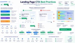
Use:
- High contrast colors
- Large clickable buttons
- Clear spacing
- Short text
- Directional visual cues
The CTA should stand out without overwhelming the overall design.
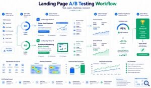
A/B Testing
Even small changes can significantly impact conversion rates.
A/B testing compares two versions of a landing page to determine which performs better.
What You Can Test
Headlines
Version A:
Increase Your Sales Today
Version B:
Grow Your Business With High-Converting Landing Pages
CTA Buttons
Test:
- Text
- Color
- Size
- Placement
Images
Compare:
- Product screenshots
- Lifestyle images
- Team photos
- Customer success visuals
Forms
Experiment with:
- Number of fields
- Required information
- Form placement
- Button text
Pricing Layout
Different pricing presentations can influence purchase decisions.
Test:
- Monthly vs annual pricing
- Discount messaging
- Pricing tables
- Feature comparisons
Best Practices for A/B Testing
- Test one element at a time.
- Gather sufficient traffic before making decisions.
- Measure statistical significance.
- Document your results.
- Continuously optimize.
Optimization is an ongoing process—not a one-time task.
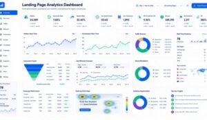
Landing Page Analytics
Without analytics, it’s impossible to know whether your landing page is performing effectively.
Track these key metrics:
Conversion Rate
The percentage of visitors who complete the desired action.
Formula:
Conversions ÷ Visitors × 100
Bounce Rate
A high bounce rate may indicate:
- Slow loading
- Weak messaging
- Poor design
- Irrelevant traffic
Average Time on Page
Longer engagement often suggests visitors find your content valuable.
Click-Through Rate (CTR)
Measures how often users click your CTA.
Low CTR may indicate:
- Weak CTA copy
- Poor button placement
- Lack of trust
Form Completion Rate
If visitors abandon forms, consider:
- Reducing fields
- Simplifying questions
- Improving trust signals
Traffic Sources
Analyze where visitors come from:
- Organic search
- Google Ads
- Social media
- Email marketing
- Referral websites
Understanding traffic sources helps optimize marketing campaigns.
Recommended Analytics Tools
Some popular analytics solutions include:
- Google Analytics
- Google Search Console
- Microsoft Clarity
- Hotjar
- Google Tag Manager
These tools provide insights into visitor behavior, helping you identify opportunities to improve conversions.
Common Landing Page Mistakes
Even well-designed landing pages can fail to convert if they contain common usability or messaging mistakes. Avoiding these issues can significantly improve your conversion rate.
1. Multiple Conversion Goals
One of the biggest mistakes is asking visitors to do too many things at once.
Examples:
- Buy a product
- Subscribe to a newsletter
- Download an eBook
- Follow social media
- Read the blog
Too many options create confusion and reduce conversions.
Best Practice: Focus on one primary CTA per landing page.
2. Weak Headlines
Your headline determines whether visitors continue reading.
Weak Example
“Welcome to Our Website”
Better Example
“Create High-Converting Landing Pages Without Writing a Single Line of Code”
A headline should communicate value immediately.
3. Long, Complicated Forms
Every additional form field increases friction.
Instead of requesting:
- Full address
- Company size
- Job title
- Phone number
- Website
Ask only for essential information such as:
- Name
- Email address
Collect additional details later if needed.
4. Slow Page Speed
A slow landing page can increase bounce rates and lower conversions.
Improve Speed By
- Compressing images
- Using WebP format
- Enabling browser caching
- Minimizing CSS and JavaScript
- Choosing reliable hosting
- Loading scripts asynchronously
Fast-loading pages create a better user experience.
5. Poor Mobile Experience
With a large share of traffic coming from mobile devices, your landing page must work seamlessly on smaller screens.
Ensure that:
- Text is readable.
- Buttons are easy to tap.
- Forms are simple to complete.
- Images scale correctly.
- Layouts remain responsive.
6. Lack of Trust Signals
Visitors are more likely to convert when they trust your brand.
Include:
- Customer testimonials
- Case studies
- Star ratings
- Client logos
- Security badges
- Money-back guarantees
- Certifications
- Media mentions
7. Generic Calls-to-Action
Buttons labeled “Submit” or “Click Here” provide little motivation.
Use action-oriented CTAs such as:
- Start Your Free Trial
- Download the Free Guide
- Get Instant Access
- Book Your Demo
- Claim Your Offer
8. Ignoring Analytics
Without measuring performance, it’s difficult to improve.
Monitor:
- Conversion rate
- Click-through rate (CTR)
- Bounce rate
- Form completion rate
- Average session duration
- Scroll depth
Regular analysis helps identify optimization opportunities.
Frequently Asked Questions (FAQs)
1. What is a landing page?
A landing page is a standalone web page designed to encourage visitors to complete one specific action, such as signing up, downloading a resource, or making a purchase.
2. What is a landing page builder?
A landing page builder is a tool that enables users to create professional landing pages using drag-and-drop functionality without requiring coding knowledge.
3. Why are landing pages important?
Landing pages focus visitors on a single goal, helping businesses generate leads, increase sales, improve ad performance, and boost conversion rates.
4. How long should a landing page be?
The ideal length depends on the complexity of the offer. Simple offers often require shorter pages, while high-value products or services may benefit from longer, more detailed pages.
5. What makes a good CTA?
A strong CTA is clear, action-oriented, benefit-focused, and visually prominent. It should make it obvious what visitors will receive after clicking.
6. Should every marketing campaign have its own landing page?
Yes. Dedicated landing pages usually perform better because they align closely with the message, audience, and goal of each campaign.
7. How often should I A/B test?
Continuous testing is recommended. Even small improvements in headlines, CTAs, or layouts can increase conversions over time.
8. Can I build a landing page without coding?
Absolutely. Modern landing page builders provide drag-and-drop editors, templates, and responsive design features, making page creation accessible to beginners.
9. Which metrics should I track?
Key metrics include:
- Conversion rate
- Bounce rate
- CTR
- Form submissions
- Average time on page
- Traffic sources
10. What is the biggest landing page mistake?
Trying to accomplish multiple goals on one page. Focus on a single objective and optimize every element around that goal.
High-Converting Landing Page Checklist
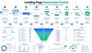
Before publishing, review this checklist:
Planning
- Define one clear conversion goal.
- Identify your target audience.
- Research user intent.
- Match the page with your marketing campaign.
Content
- Write a compelling headline.
- Add a persuasive subheadline.
- Highlight benefits over features.
- Include social proof.
- Keep copy concise and easy to scan.
Design
- Use a clean, uncluttered layout.
- Add high-quality images or videos.
- Ensure mobile responsiveness.
- Improve page speed.
- Maintain visual consistency with your brand.
CTA
- Use action-oriented button text.
- Position CTAs strategically.
- Make buttons easy to find and click.
- Minimize distractions.
SEO
- Include your primary keyword naturally.
- Optimize the title tag and meta description.
- Use descriptive image alt text.
- Create a clean URL structure.
- Link to relevant internal content.
Testing
- Test headlines.
- Test CTA wording.
- Test images.
- Test form length.
- Measure results with analytics tools.
Expert Tips for Higher Conversion Rates
To maximize performance:
- Use customer testimonials near the CTA.
- Add urgency with limited-time offers where appropriate.
- Reduce unnecessary navigation links.
- Keep forms as short as possible.
- Display trust badges close to payment or signup sections.
- Optimize for mobile-first users.
- Refresh landing pages regularly based on analytics.
Final Thoughts
A high-converting landing page is the result of thoughtful planning, persuasive copywriting, user-focused design, and continuous optimization. While modern landing page builders simplify the technical side of page creation, success depends on understanding your audience and guiding them toward one clear action.
Remember that optimization is an ongoing process. Regular testing, performance analysis, and incremental improvements can lead to meaningful gains in conversion rates over time.
Ready to build landing pages that generate more leads and sales?
Start with a single goal, craft a compelling headline, write benefit-driven copy, add a strong call-to-action, and measure your results. As you learn from user behavior and refine your pages, you’ll create landing experiences that not only attract visitors but also convert them into loyal customers.
Consistency, testing, and customer-focused messaging are the keys to long-term success.
Conclusion
Creating high-converting landing pages is both an art and a science. By combining a clear objective, persuasive copy, compelling visuals, strong CTAs, and continuous optimization, you can improve user experience and increase conversions.
Whether you’re promoting a product, generating leads, or growing your email list, an effective landing page can become one of the most valuable assets in your digital marketing strategy. Focus on solving your audience’s problems, keep the experience simple, and let data guide your improvements over time.
Leave a Reply